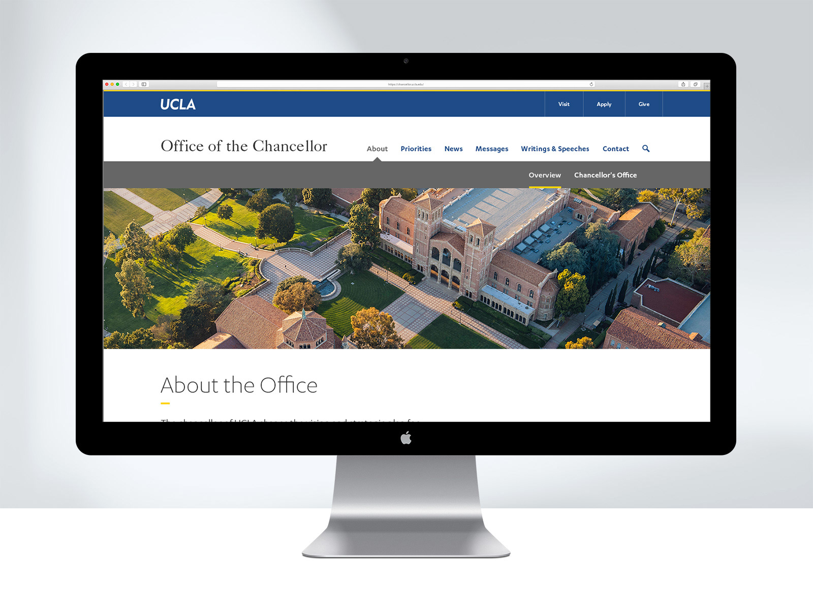
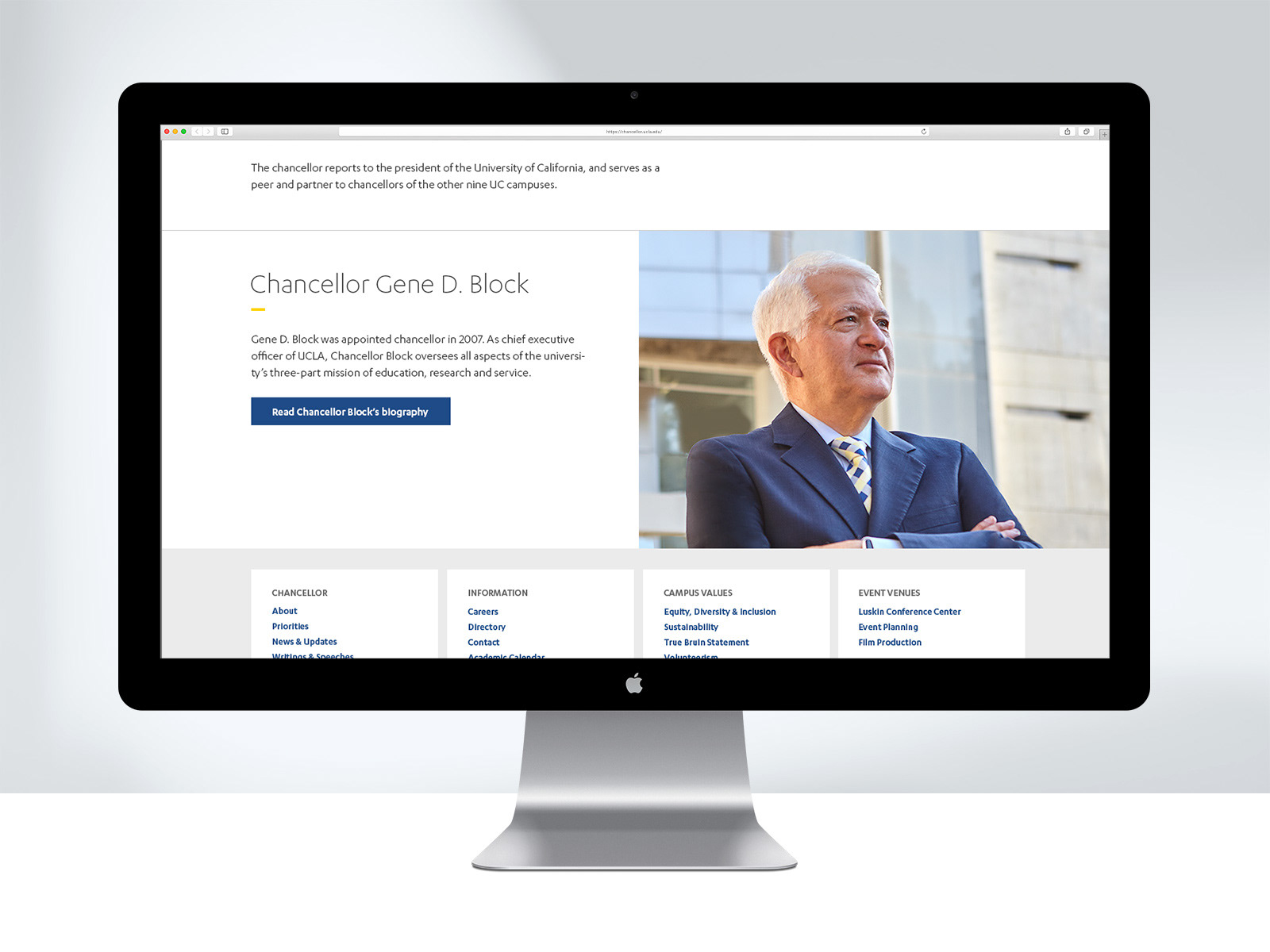
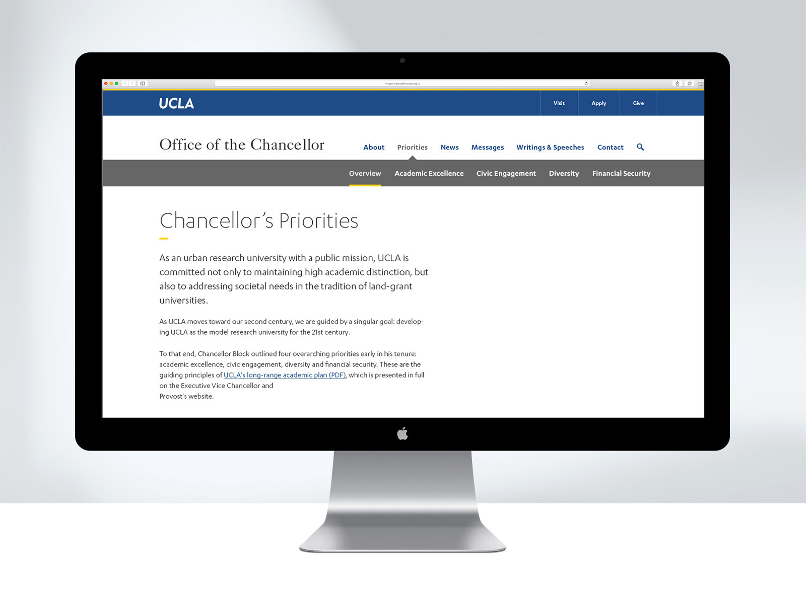
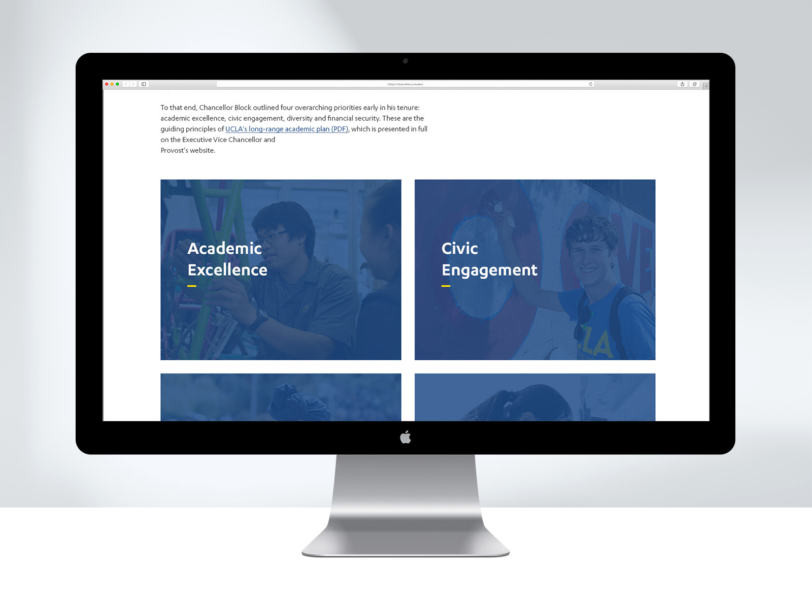
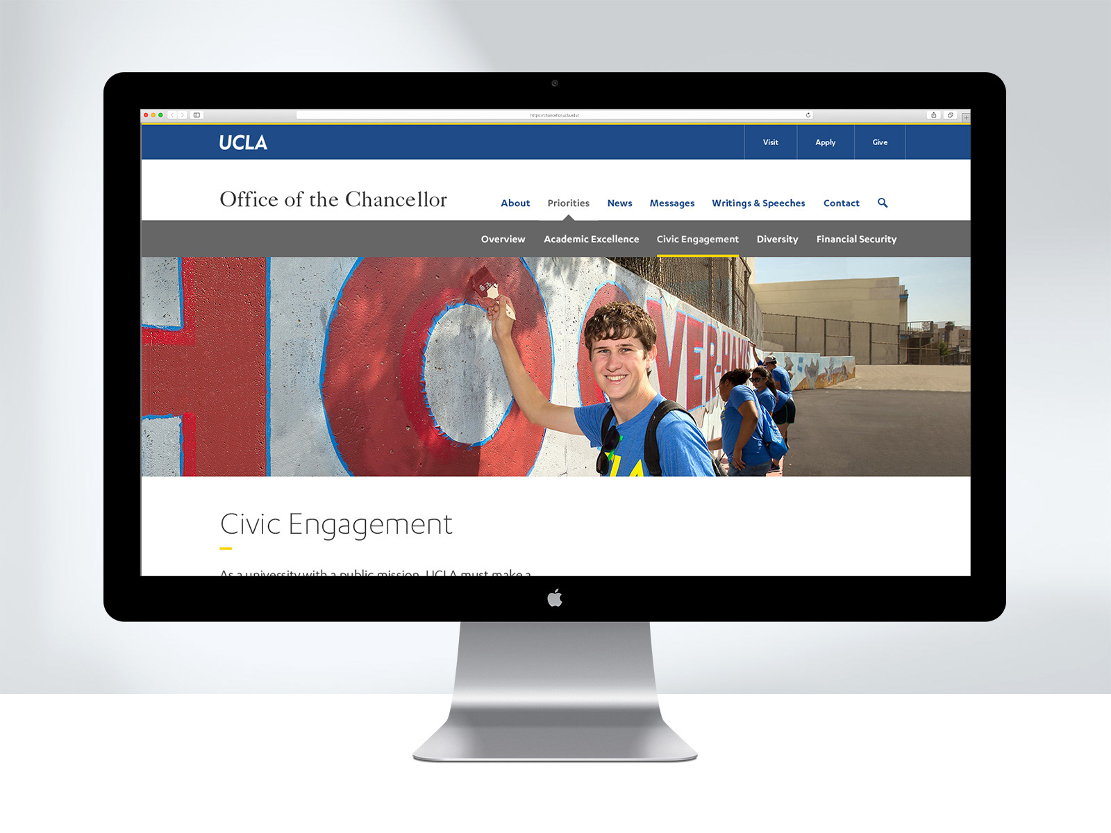
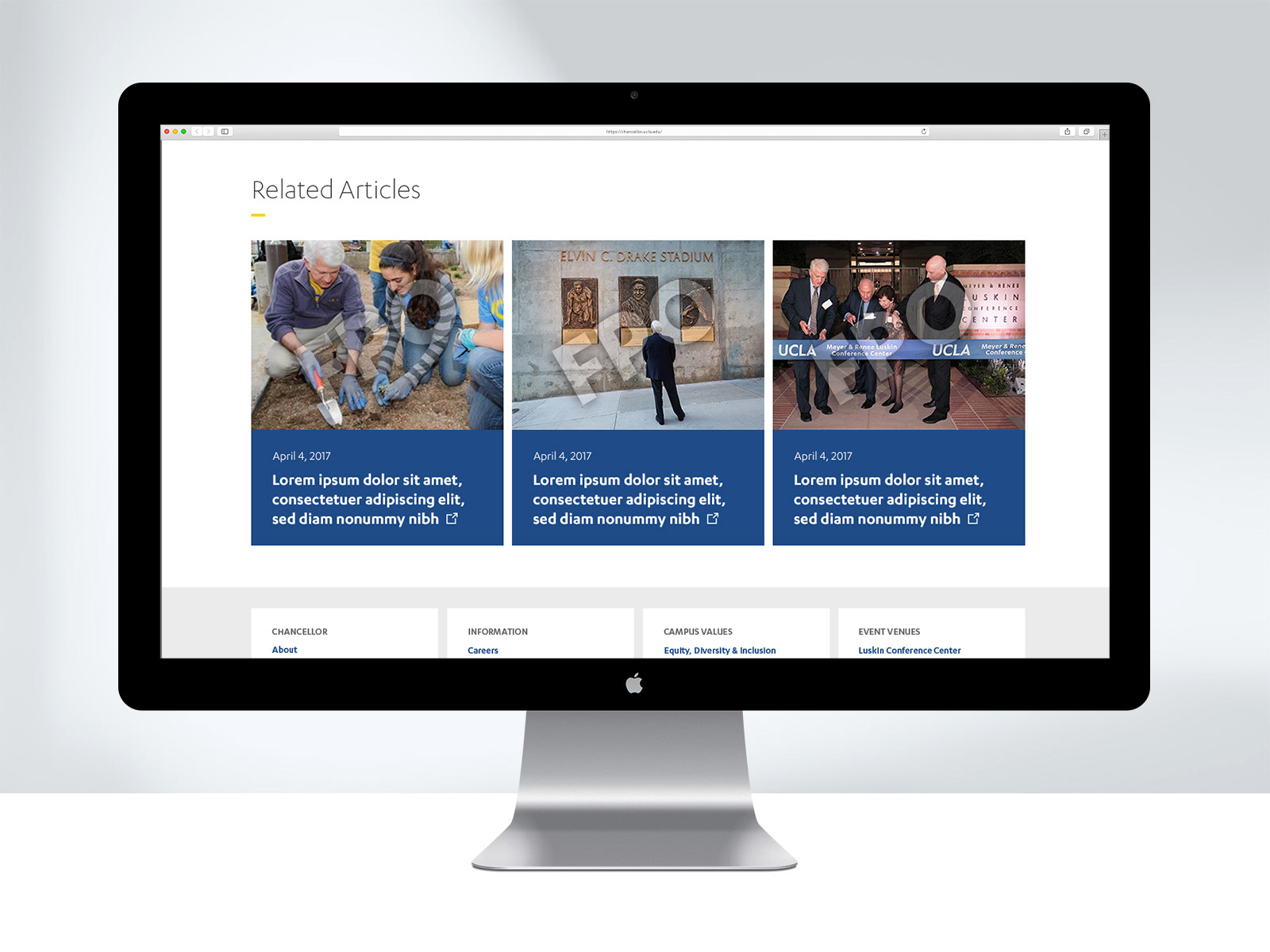
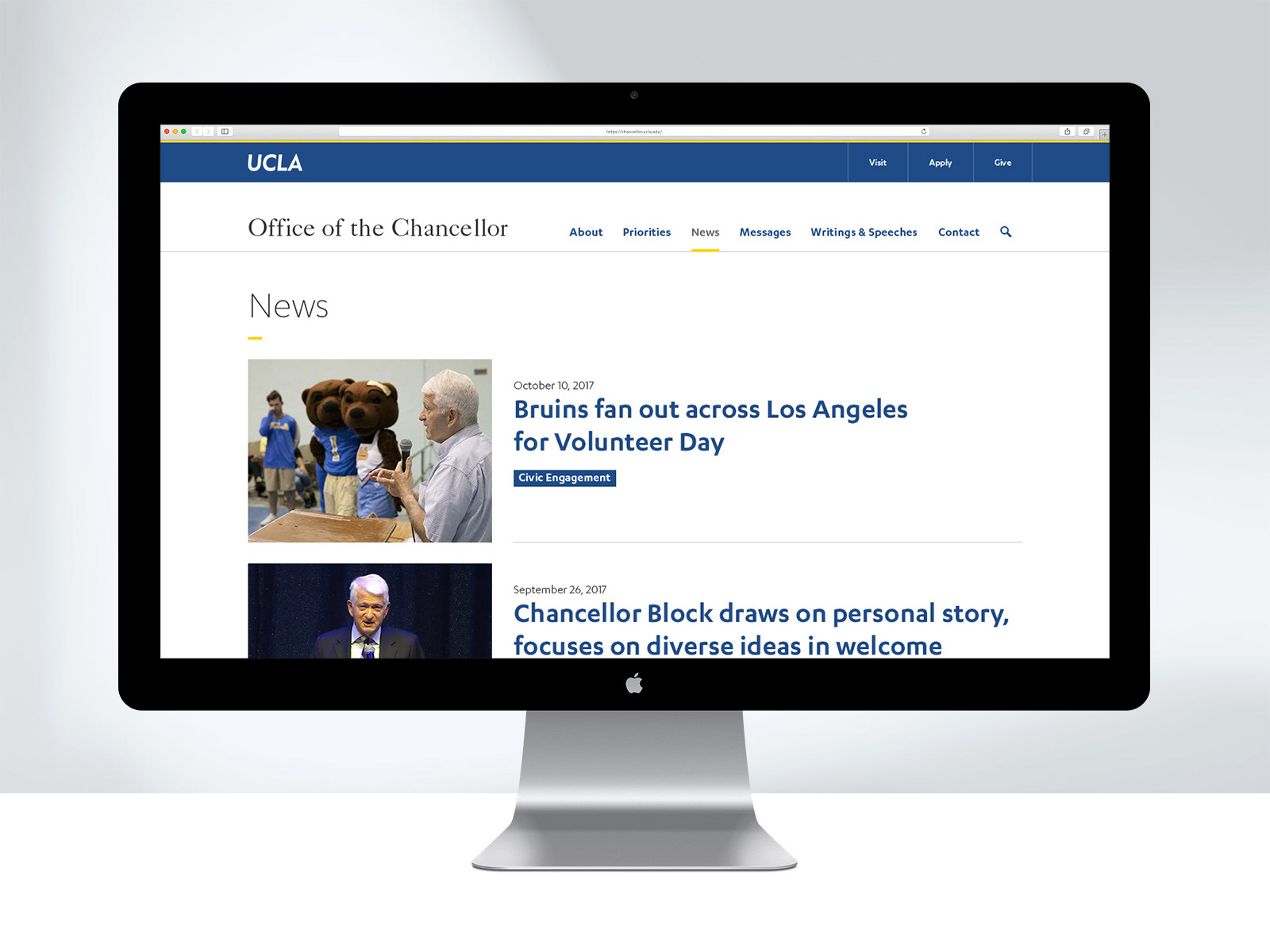
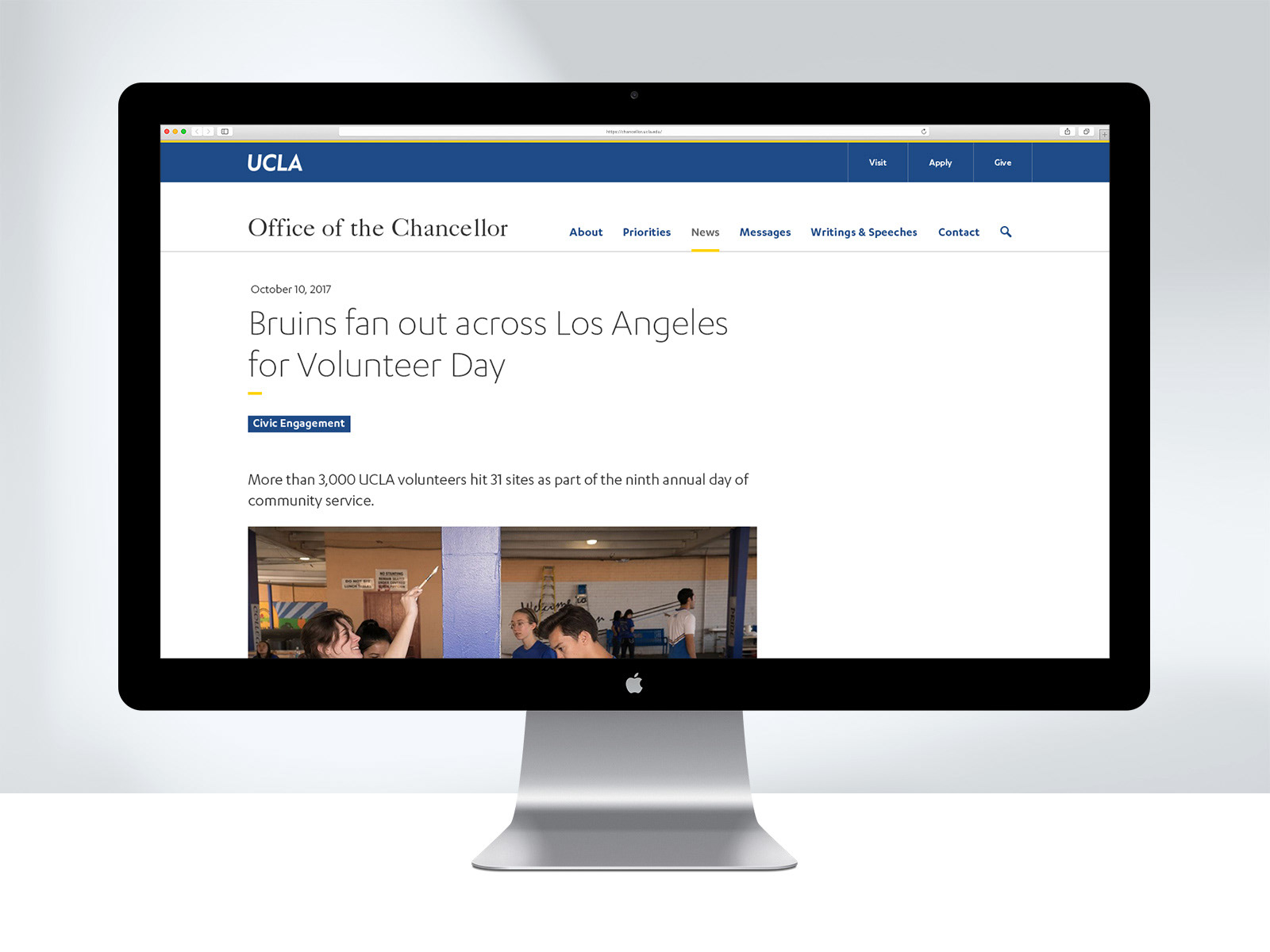
In 2017, we were task to redesign the UCLA Chancellor's website with a modern look that is ADA compliant and responsive. We chose a clean, simplified layout utilizing a lot of open space to give it a fresh feel. We focused on contrast of dark blues and greys with a hint of yellow to give it a stately ambience. The photographic direction suggested was a photojournalism style that is candid, emotional, action-oriented, and has a dramatic shallow depth of field. The site was originally populated with existing photography but going forward the plan is to work in this style.
As the senior designer of the digital team, I worked closely with UX, and dev throughout the project. I also managed another designer in to help with the site design.
